In 2025’s digital-first world, designing layout is more vital than ever for standing out online and offline. Designers face fierce competition for attention, balancing usability with the need to spark engagement and boost conversions.
This article is your guide to mastering the art and science of designing layout for web, mobile, and print projects in the year ahead. You’ll discover the latest trends, foundational principles, a proven step-by-step process, advanced strategies, and future-proofing techniques.
Ready to elevate your skills and achieve professional results? Dive in for expert tips that will help your layouts thrive in a fast-evolving landscape.
The Evolving Landscape of Layout Design in 2025
The world of designing layout is rapidly transforming as we approach 2025. With technology, user expectations, and design philosophies all evolving, staying ahead means understanding the forces shaping modern layouts. Let’s explore the key trends, tools, user behaviors, compliance standards, and sustainability factors defining the new era of designing layout.
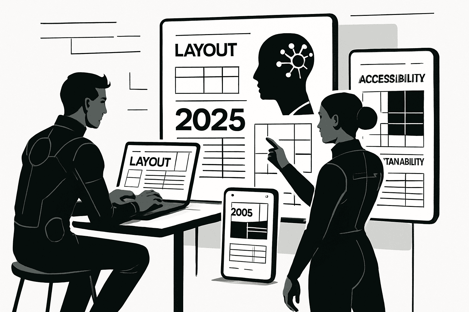
Key Trends Shaping Layout Design
In 2025, designing layout is all about clarity, impact, and inclusivity. Minimalism is taking center stage, with clean spaces and bold typography helping content stand out. Immersive visuals—think subtle animations and interactive elements—draw users in.
AI and automation have become powerful allies, enabling designers to generate layouts faster and smarter. Accessibility and inclusivity are now non-negotiable, with flexible color schemes and dark mode dominating interfaces. Mobile-first thinking and responsive design aren’t just trends—they’re necessities.
For a deeper dive into these shifts, check out the Top 10 Graphic Design Trends 2025, which highlights how AI and bold minimalism are influencing designing layout across industries.
Technology and Tools Transforming Layouts
Modern designing layout relies on cutting-edge tools like Figma and Framer, which streamline workflows and enable real-time collaboration. These platforms offer smart grids and dynamic spacing, making structure effortless and responsive across devices.
AI-powered platforms are now able to suggest layouts based on content and user personas, revolutionizing the creative process. Prototyping and handoff tools are tightly integrated, ensuring designers and developers work seamlessly together.
Features such as automated accessibility checks and live previews mean that designing layout is more efficient and inclusive than ever before. The right tools not only save time but also help teams achieve pixel-perfect results.
User Behavior and Interaction Patterns
Designing layout in 2025 must address shrinking attention spans. Data shows users scan rather than read, so layouts need to be intuitive and scannable. Micro-interactions—like animated buttons or feedback cues—keep users engaged without overwhelming them.
Statistics reveal that mobile usage has overtaken desktop, making mobile-first layouts essential. Intuitive navigation and clear hierarchies matter more than ever, as users expect seamless experiences across all devices.
Incorporating these insights into designing layout ensures that users stay engaged, find information quickly, and enjoy interacting with digital products.
Accessibility and Compliance Standards
With stricter regulations and higher user expectations, accessibility is a cornerstone of designing layout in 2025. Adhering to WCAG 2.2 and ADA guidelines is essential for both legal compliance and ethical responsibility.
Accessible color contrasts, scalable font sizes, and keyboard-friendly navigation are now standard. For example, using a 4.5:1 contrast ratio ensures text is readable for all users. Clear navigation structures and skip links help those using assistive technologies.
Ignoring accessibility in designing layout can lead to legal action and lost trust—so it’s not just good practice, it’s business-critical.
Sustainability and Eco-conscious Design
Designing layout is also embracing sustainability. Lighter, energy-efficient layouts reduce digital carbon footprints—a growing concern for eco-conscious brands. Optimized assets, streamlined code, and reduced animations not only save resources but also improve load times.
Studies show that simple, efficient layouts use less energy and provide a better user experience. By prioritizing sustainability in designing layout, designers contribute to a greener web while meeting modern user expectations.
Core Principles of Effective Layout Design
Creating a standout digital experience in 2025 requires more than just creativity—it demands a deep understanding of core principles that make designing layout both artful and strategic. Whether you’re refreshing a brand’s website or crafting mobile and print projects, mastering these fundamentals will ensure your layouts are visually appealing, user-friendly, and conversion-driven.

Hierarchy and Visual Flow
Hierarchy is the backbone of designing layout—it guides the viewer’s eye, ensuring critical information stands out. You can establish hierarchy through size, color, and placement. For instance, headlines often use larger, bolder fonts, while supporting text is smaller and subtler.
Designers frequently use patterns like the Z-pattern and F-pattern for web and mobile layouts. The Z-pattern works well for landing pages, directing users from left to right, while the F-pattern suits content-heavy pages by mirroring natural reading habits.
Visual flow leverages psychological principles, like contrast and proximity, to help users intuitively navigate content. By prioritizing hierarchy, you make every interaction purposeful and seamless.
Balance, Alignment, and Spacing
Balance in designing layout refers to the distribution of visual elements to create stability. Symmetrical balance uses identical or similar elements on both sides, conveying formality and order. Asymmetrical balance, on the other hand, mixes different shapes and sizes for a dynamic, modern feel.
Balance Type | Effect | Example Use Case |
|---|---|---|
Symmetrical | Formal, orderly | Corporate websites |
Asymmetrical | Dynamic, engaging | Creative portfolios |
Consistent alignment ensures elements line up neatly, while generous spacing (white space) prevents clutter. Grids and modular systems are your secret weapons—use them to maintain alignment and rhythm across devices.
Contrast, Color, and Typography
Contrast is essential for drawing attention and improving readability in any designing layout. Use light text on dark backgrounds (and vice versa), or pair bold colors with neutrals for emphasis. In 2025, expect vibrant gradients and variable color schemes to dominate, as highlighted in the 2025 Global Design Trends Outlook.
Color theory helps create harmonious palettes—combine complementary or analogous colors for balance. Typography also matters: pair a strong headline font with a readable body typeface, and maintain a clear type hierarchy for easy scanning.
Consistency and Branding
Consistency is what transforms a good designing layout into a memorable brand experience. Reusing the same colors, fonts, and UI components strengthens recognition and trust. Style guides are invaluable—they document standards for everything from button shapes to iconography.
Reusable components not only speed up your workflow but also ensure consistency across web, mobile, and print. Always test your designs on different platforms to confirm that branding is cohesive and unmistakable, no matter where users engage.
Usability and Conversion Optimization
Usability is the ultimate test of your designing layout—if users can’t find what they need or complete actions easily, even the most beautiful design fails. Prioritize intuitive navigation, clear calls-to-action (CTAs), and logical placement of forms.
Place CTAs where users naturally pause, like the end of a content section or in sticky headers. Optimized layouts can boost conversion rates dramatically, with studies showing that strategic placement and clarity can increase signups or sales by up to 30%. Always test and refine your design to keep performance high.
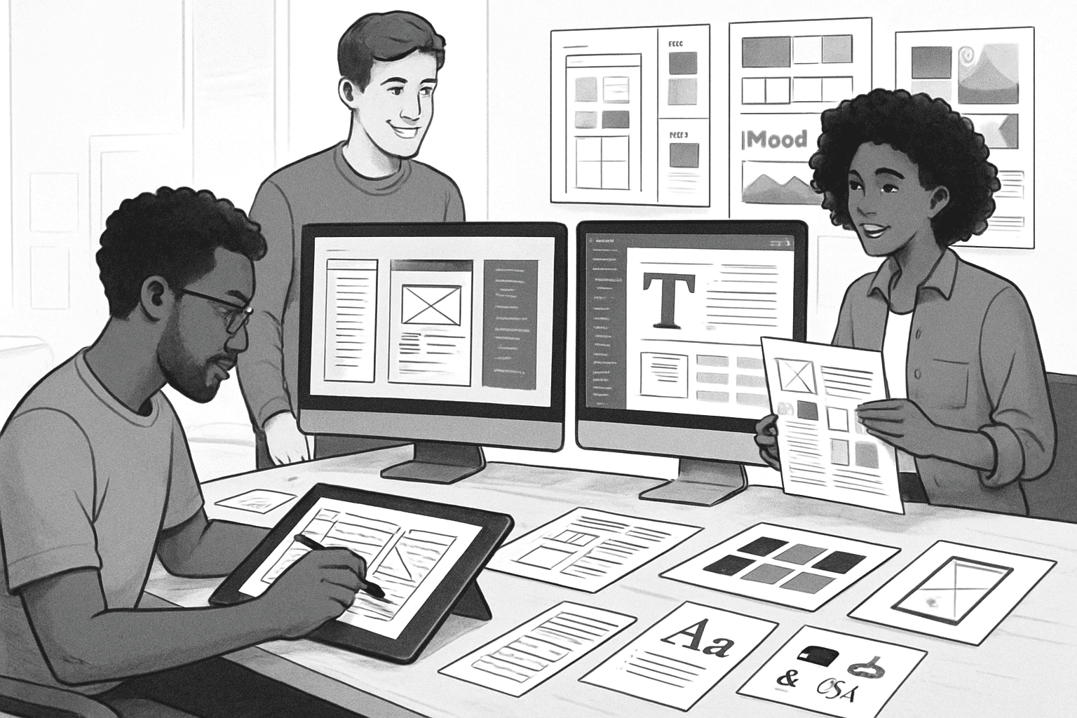
Step-by-Step Guide to Designing a Modern Layout
Designing layout for modern digital experiences in 2025 requires a methodical process that blends creativity, technology, and user insight. Follow these nine essential steps for a future-proof, conversion-driven result.
Step 1: Define Purpose and Audience
Every successful designing layout project starts with clarity. Define the main goal of the website, app, or print piece. Is it to inform, sell, or engage?
Understand your target audience by developing user personas. List their needs, pain points, and preferences. Gather requirements from stakeholders to align business goals with user expectations.
Ask questions like: Who will use this site? What actions do we want them to take? The clearer your audience and purpose, the more targeted your designing layout decisions will be.
Step 2: Content Planning and Wireframing
Effective designing layout begins with organized content. List all required elements—navigation, headlines, images, calls-to-action, and forms.
Sketch low-fidelity wireframes to map out structure without distractions. Use simple shapes to represent content blocks. This helps visualize hierarchy and flow before jumping into detailed design.
Prioritize content based on user needs and business objectives. Keeping the focus on core elements streamlines the designing layout process and prevents clutter.
Step 3: Establish Grid Systems and Structure
A robust grid is the backbone of any designing layout. Choose the right system, such as a 12-column grid for web or modular layouts for mobile.
Set responsive breakpoints for various devices—mobile, tablet, desktop. A well-chosen grid ensures alignment and visual harmony, making the interface feel balanced.
Look at SaaS and e-commerce sites for inspiration; they often showcase grids that adapt gracefully. When designing layout, grids make scaling and consistency simple.
Step 4: Visual Design and Branding Elements
Inject brand personality into your designing layout by applying consistent colors, fonts, and imagery. Use the brand’s logo, icons, and illustrations to reinforce identity.
Balance visual harmony by choosing complementary color palettes and typefaces. Make sure all elements support the overall message.
Consistency in visual design helps users instantly recognize your brand. When designing layout, always check that each piece aligns with the style guide.
Step 5: Accessibility and Responsive Design
Accessibility is non-negotiable in every designing layout. Test your designs with screen readers and ensure keyboard navigation is seamless.
Use scalable units like em and rem for fonts and spacing. Employ flexible containers so layouts adapt to any device—touch, mouse, or even voice.
Prioritize color contrast and readable font sizes. By making your designing layout accessible, you open your work to everyone, regardless of ability.
Step 6: Prototyping and User Testing
Bring your designing layout to life with interactive prototypes using tools like Figma or Framer. Test flows, transitions, and interactions in real-time.
Conduct usability tests with actual users, gathering feedback on navigation, clarity, and engagement. Iterate based on their input for a polished result.
AI-driven tools are increasingly shaping this step—see the AI-Driven Graphic Design Survey for insights on how AI enhances layout perception and generation, enabling smarter, faster prototyping.
Step 7: Handoff and Implementation
Smooth collaboration is vital when turning your designing layout into a functioning product. Prepare detailed design specs, export assets, and document components.
Use design systems to maintain consistency and speed up development. Share clear guidelines for typography, colors, and spacing.
Work closely with developers to ensure pixel-perfect implementation. A well-documented designing layout minimizes confusion and streamlines the build process.
Step 8: Performance Optimization and Launch
A fast, responsive product depends on optimizing your designing layout. Compress images, use modern font formats, and clean up code.
Test on different devices, browsers, and network speeds to spot bottlenecks. Slow layouts lose users—speed is conversion.
Monitor analytics after launch. Look for drop-off points and opportunities to refine the designing layout for even better performance.
Step 9: Iteration and Continuous Improvement
Designing layout is an ongoing process, not a one-time event. Collect user data and feedback post-launch to identify pain points.
Use A/B testing to compare layout variations and boost conversions. Schedule periodic audits to keep your design fresh and aligned with the latest trends.
Continuous improvement ensures your designing layout remains relevant, competitive, and effective as technologies and user behaviors evolve.
Advanced Layout Strategies for High-Impact Design
Looking to take your designing layout skills to the next level? In today’s fast-paced digital world, high-impact layouts demand more than just good looks—they require intelligence, adaptability, and user focus at every step. Let’s dive into advanced strategies that will set your projects apart, whether you’re designing for SaaS, e-commerce, or bold new platforms.
Personalization and Dynamic Layouts
Personalization has become a cornerstone of effective designing layout. Today, users expect interfaces that adapt to their needs—think dashboards that reorganize based on user behavior or e-commerce sites that surface relevant products in real time. AI-driven solutions are making this possible by analyzing user data and generating layouts on the fly.
For example, dynamic content blocks can shift according to user preferences or past actions, creating a unique journey for every visitor. This approach not only boosts engagement but also increases conversion rates. If you’re curious about how AI is revolutionizing spatial and layout design across industries, check out this insightful AI in Architecture Guide for practical parallels.
The key takeaway? Harnessing personalization in your designing layout can deliver remarkable business results and user satisfaction.
Micro-interactions and Animation
Micro-interactions and animations are subtle ways to elevate your designing layout and increase user delight. These tiny moments—like a button ripple, a card lift on hover, or a loading spinner—guide users, provide feedback, and create a sense of polish.
Consider these animation best practices:
Keep transitions short (under 300ms) for snappy feedback.
Use motion to direct attention, not distract.
Test performance to ensure smoothness on all devices.
Integrating thoughtful micro-interactions in your designing layout can make navigation effortless and encourage users to engage more with your product. Don’t underestimate the power of a well-timed animation to improve usability and brand perception.
Data Visualization and Information Hierarchy
Modern designing layout often involves presenting complex information in a digestible way. Data visualization—using charts, graphs, and infographics—transforms raw data into clear, actionable insights. A strong information hierarchy ensures users find what they need quickly.
Tips for effective data-focused layouts:
Use color and size to emphasize key metrics.
Group related information together for better scannability.
Leverage interactive elements, like tooltips or filtering, to enhance exploration.
Choosing the right tools and frameworks for interactive data layouts can dramatically improve both comprehension and retention. Remember, clarity is king in any designing layout involving data.
Mobile-first and Cross-platform Consistency
With mobile traffic dominating in 2025, a mobile-first approach is crucial for any designing layout. Start by designing for the smallest screen, then scale up to tablets and desktops. This ensures that every user, regardless of device, enjoys a seamless experience.
Best practices include:
Responsive grids that adapt to screen size.
Flexible images and type that remain legible everywhere.
Consistent navigation patterns across platforms.
Maintaining cross-platform consistency in your designing layout builds trust and makes your brand feel reliable—no matter where users interact.
Conversion-focused Layouts for SaaS and Startups
For SaaS and startup teams, a conversion-focused designing layout is a game-changer. Every pixel should work toward a clear business goal—whether that’s sign-ups, demo bookings, or onboarding completions.
Strategies to optimize for conversion:
Place CTAs above the fold and repeat them naturally.
Limit form fields to reduce friction.
Use visual cues like arrows or contrasting buttons to guide action.
By analyzing conversion data and iterating your designing layout, you can continually lift performance and achieve measurable growth.
PixlJoy Design: Framer-Powered Conversion Layouts
PixlJoy Design is a Framer-powered web design studio specializing in designing layout solutions for SaaS and startups. Their expertise lies in building conversion-focused layouts that blend Framer’s advanced technology with sales psychology for proven business growth.
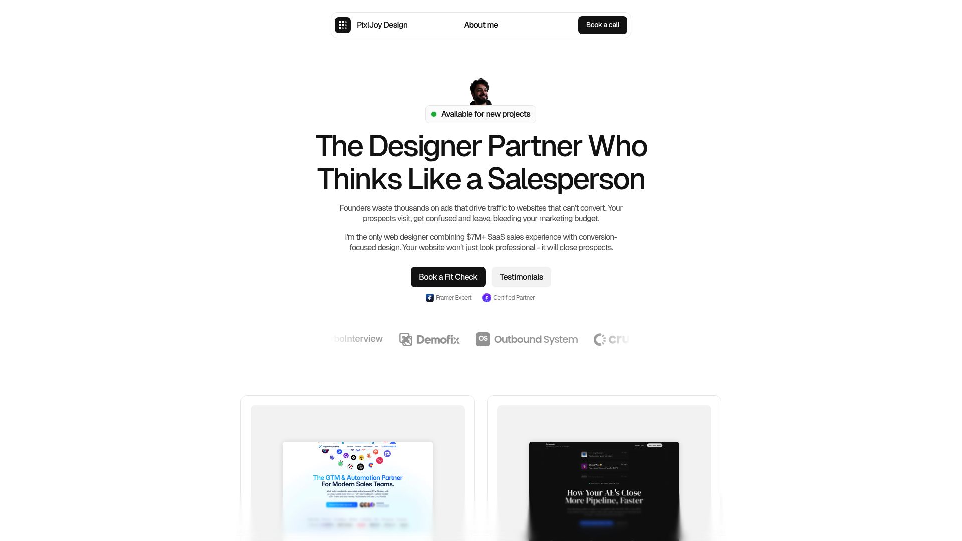
Industries served include AI, B2B SaaS, fintech, and more. With rapid turnarounds, async collaboration, and a focus on measurable results, PixlJoy delivers high-impact designing layout projects efficiently.
If you’re seeking a strategic partner to elevate your next project, PixlJoy’s unique combination of design systems, conversion optimization, and Framer mastery sets them apart.
Future-Proofing Your Layouts: Trends and Best Practices for 2025
Staying ahead in the world of designing layout means preparing for change before it arrives. As technology evolves, so do user expectations and industry standards. To create layouts that stand the test of time, it’s crucial to embrace innovation, anticipate trends, and continually refine your approach.
Embracing AI and Automation in Design
Artificial intelligence is quickly transforming the landscape of designing layout. AI-powered tools can now suggest optimal layouts, adjust spacing automatically, and even personalize content for unique users. This not only speeds up the creative process but also ensures layouts are data-driven and user-focused.
Automated accessibility checks have become standard, flagging issues like poor contrast or missing alt text before launch. As more companies adopt these intelligent systems, designers can focus on creativity while AI handles repetitive tasks. Industry experts predict that by 2025, most digital products will use some form of AI in their layout workflows.
Preparing for Emerging Technologies
The horizon for designing layout is expanding with the rise of AR, VR, and voice interfaces. These platforms demand flexible, modular design systems that adapt seamlessly to new devices and interaction patterns. For instance, spatial layouts in AR environments require different hierarchy and navigation than traditional web or mobile screens.
Forward-thinking teams are already experimenting with immersive layouts and preparing their design systems for unknown formats. By building adaptability into your process now, you’ll be ready to tackle the next wave of technology—no matter what form it takes.
Staying Ahead with Continuous Learning
Continuous education is essential for anyone serious about mastering designing layout. The design industry evolves rapidly, and staying updated means following thought leaders, joining online communities, and attending workshops or webinars. Top designers regularly invest in new courses and certifications to sharpen their skills.
Some favorite resources include online platforms like Coursera, industry blogs, and annual conferences. By making learning a habit, you ensure your layouts remain modern, effective, and aligned with best practices—no matter how trends shift.
Measuring Success and Iterating for Growth
A future-proof approach to designing layout always includes robust measurement and ongoing improvement. Track key performance indicators such as engagement rates, conversions, and user retention to gauge what’s working. Analytics tools and user feedback provide actionable insights for your next iteration.
Adopt a mindset of experimentation: run A/B tests on layout changes, analyze results, and refine your designs accordingly. Regular audits and updates keep your layouts competitive, ensuring they continue to deliver value as user needs and technologies evolve.
Now that you’ve got the latest strategies for designing high-impact layouts in 2025, it’s time to put those insights to work for your business. Whether you’re looking to boost conversions, launch a new SaaS product, or simply want a layout that stands out and performs, getting expert guidance can make all the difference. If you’re ready to see how a conversion-focused, Framer-powered website can elevate your brand and drive real results, let’s connect. You can easily Book a call and we’ll talk through your goals, challenges, and how to create a layout that truly works for you.
Let’s build a website that grows your business
Book a free call to get a site that builds trust, attracts leads, and converts clients.